Requirements
- Build a single page directory for Western Science departments research section that lists all Faculty members.
- Each member would have an about card and would include fields for, at the current ask: Home Department; Research/Areas of Expertise tags; Core research summary; Link to their website; and a headshot. These fields would be searchable and sortable (A-Z).
Project Scope
- Problems to address:
- No singular source of information about researchers from across the various disciplines – segmented information within department-level listings. Out of date or non-existent researcher pages for external audience to learn more.
- Organic traffic of our users (80%+ of our traffic source) are currently being split in the search results to varying effect.
- We want to:
- Lead the way and create a one-stop shop for those looking to explore the research that Western Science is undertaking and who is carrying out these investigations.
- Connect our users (new and current) with a more streamlined experience – driving traffic to a singular, accurate database of information.
- Revitalize the branding for consistency and an updated look, demonstrating that this is a priority and relevant to audiences today.
- Update the tagging and research meta data for increased search engine performance.
Project Goal
Develop and launch a single Western Science researcher listing. This website area will communicate to external audiences the work and impact of our researchers and act as part of our central hub for Western Science research.
Explorations and Inspirations
- BMI Database-
-
What do I like?
Very Organized. Clear pictures and the border style gains attention. The website doesn't overwhelm the user with information. Few pictures per row allow the user to view all the investigators carefully. The dynamic search function saves time and helps filter more relevant names quickly. Lastly, the website is accessible as it shows detailed information of the investigator on one click.
-
What could be improved?
I would have added some more relevant information with their names like their role and department. They could remove the OR between Search by name and Filter by research area.
-
Any thoughts or considerations?
Overall, I think the website is decent. I would have preferred if there was a solid border between pictures as even though the current border looks good but uneven background of pictures makes the website look unpleasant. Furthermore, I would have enjoyed some more relevant information about investigators as it hard to differentiate between them with just their name and photos.
Website Rating: 3/5
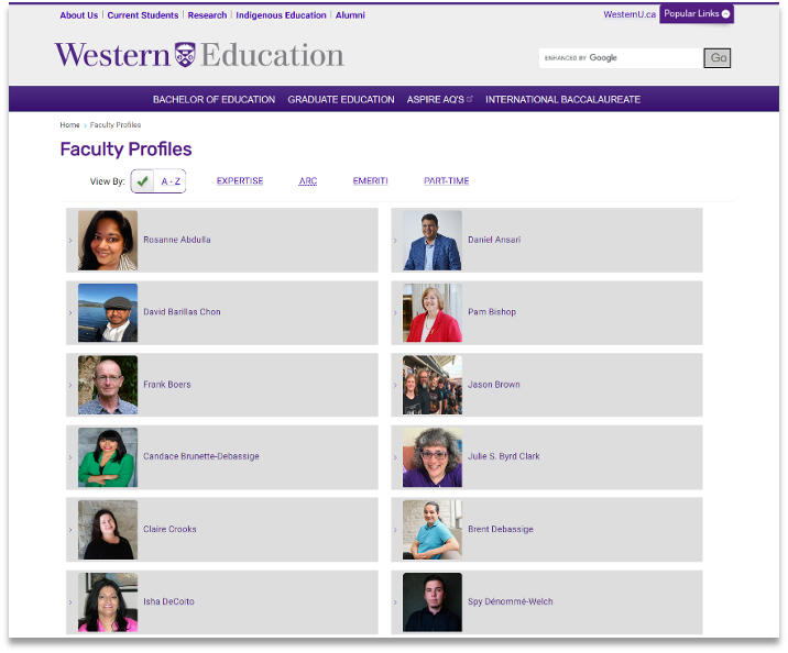
- Education Database
-
What do I like?
I like how I can filter the faculty profile by a variety of different ways. I also liked how all the faculty profiles are on one single page and the user doesn't have to browse through multiple pages to find the right person. Furthermore, even though their background pictures are taken from different locations but a a grey box style gives profile a consistent look.
-
What could be improved?
There is a lot of empty space in boxes which could be better utilized. It's hard to differentiate between faculty profiles using just picture and name, it would have been better if they also added the faculty profiles department and role with the name. The pictures are too small and its hard to recognize individuals. They could have styled individual profiles by decreasing the profile picture box size and by having profile names below pictures. Lastly, the website is inconsistent in design as few box sizes are bigger than others.
-
Any thoughts or considerations?
I liked their filter function as it allows us to filter the database in different ways. I also enjoyed how all the profiles are listed on one single page. I would have personally added a dynamic search bar to find the profile name and also the profile list could be improved a lot in terms of styling.
Website Rating: 2/5
Exploration 2.0
For the BMI and Education websites, what do I like and dislike about the profiles?
- BMI:
-
Like:
· Search by name dynamic function
· Clear pictures
· Multiple pages to arrange many profiles
· Only 3 profiles per row
· Filter by research area function
-
Dislikes:
· Not Arranged in an alphabetical order
· No solid border separation
· No information to differentiate between profiles like department, role, etc.
- Education Website:
-
Like:
· Option to filter using Expertise, Arc, Emeriti, Part-time
· All profiles in one page
· Clear grey solid border to separate profiles
-
Dislike:
· Could use simpler words like retired instead of emeriti
· No search by name function
· No consistency in profile picture background/ pictures not clear/ pictures small in size and hard to recognize individuals
· Lot of empty space between profiles
· No information to differentiate between profiles like department, role, etc.
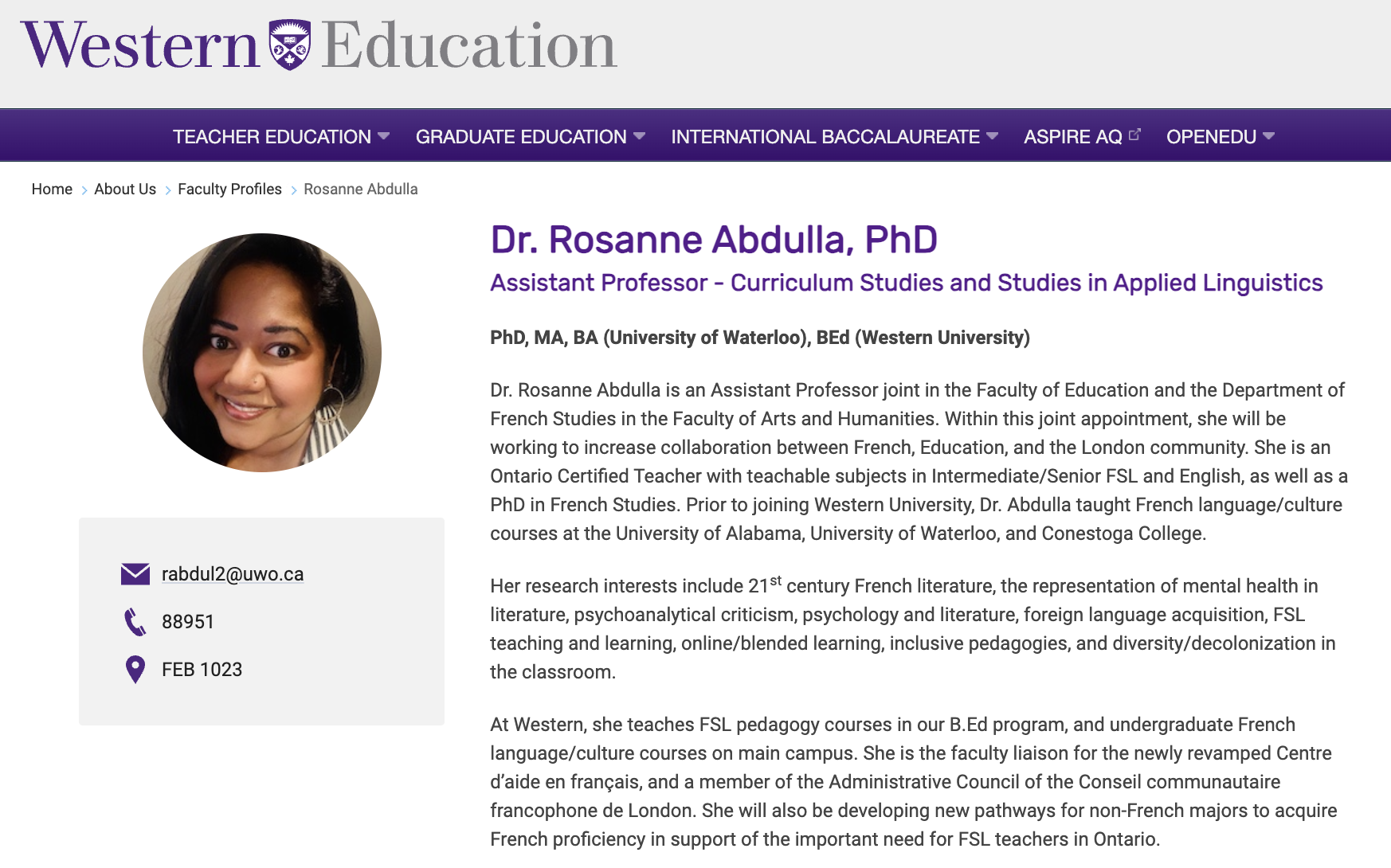
Should there be more or less information?
I feel there should more information like department, role, contact and maybe research area. As a student, I feel profile pictures should not be a priority as when students view through faculty websites they are more interested in research their professors are doing and how they can contact them than how they look. Furthermore, it could be argued that on just one click you could view the same information of professors on a different page but personally its more feasible to me as user to compare and view all professors information on the same page.
How can we plan for little information and a lot of information?
For a lot of information, multiple pages can be added or as I mentioned above pictures could be avoided as it would allow to add more relevant information instead.
For little information, name, role, contact, research area and department could be added as those few are the most important.
Should we consider adding further components to these pages? What would they be?
Yes, we shall add further components to the page to make them more accessible are
· Name
· Role
· Email Id
· Contact Number
· Room Number
· Area of Research
· Research Interest
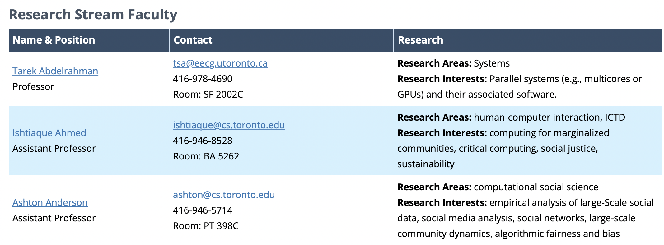
Example-
How would you approach gathering and updating the information for ~1000 profiles. If you were the project manager, how would you plan and ensure everyone submits? What's the submission mechanism? (web form?)
The easiest way I could think of is creating a google form with different attributes like name, contact, research etc. Once the faculty staff fills the form it could be transformed to a google sheet and added to the website folder.
I think it would be really difficult to gather information of all the staff as some would reply, some would fill the forms and other would ignore. Data gathering through forms is a good way but not very efficient. It would be easier to first work with information already available us and add remaining attributes as we go.
How do you think we can manage the data gathering? What's the pathway for collecting information?
We could manage data gathering through google forms as mentioned above and transform them to google sheets taking advantage of the google ecosystem.
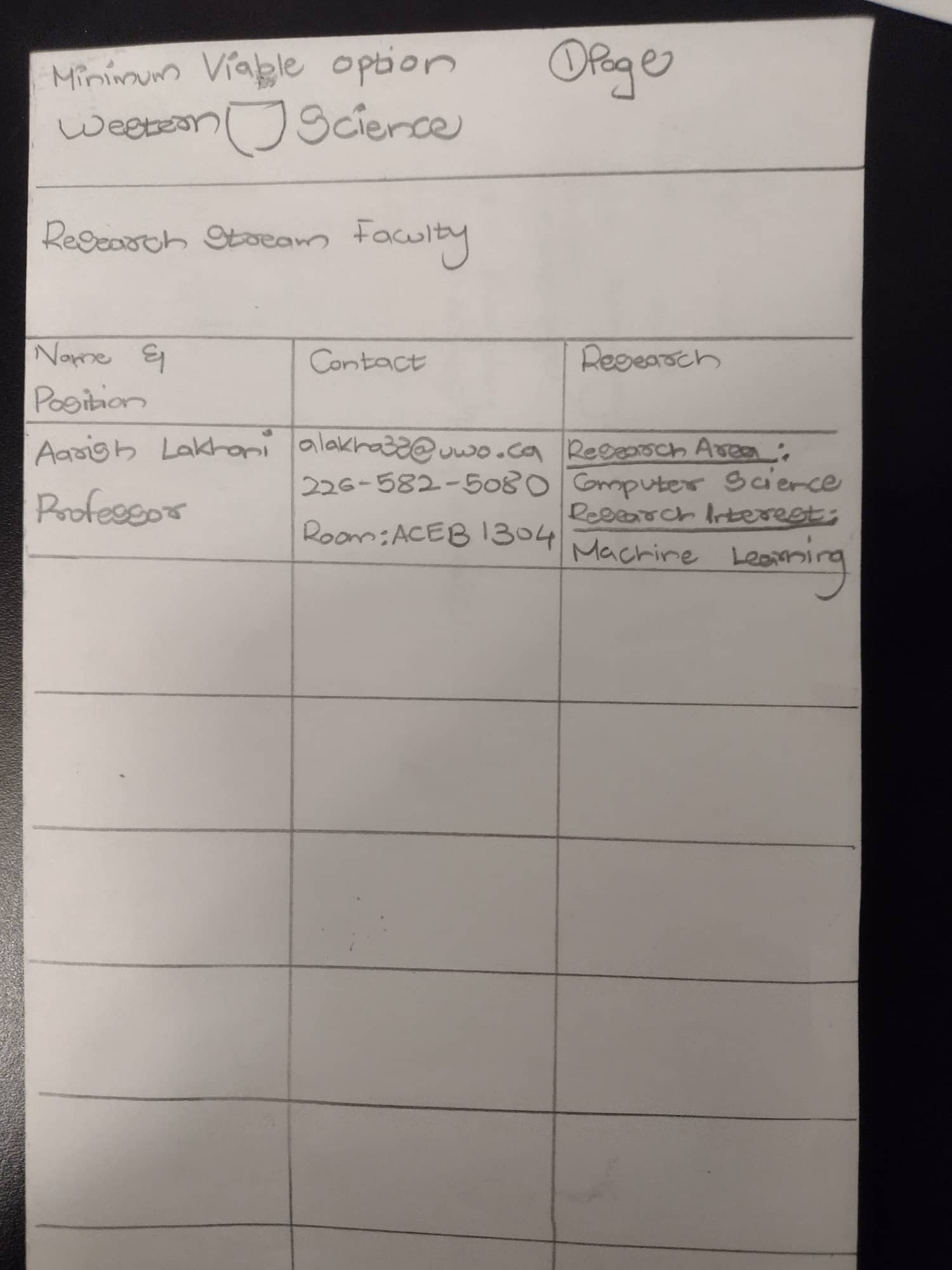
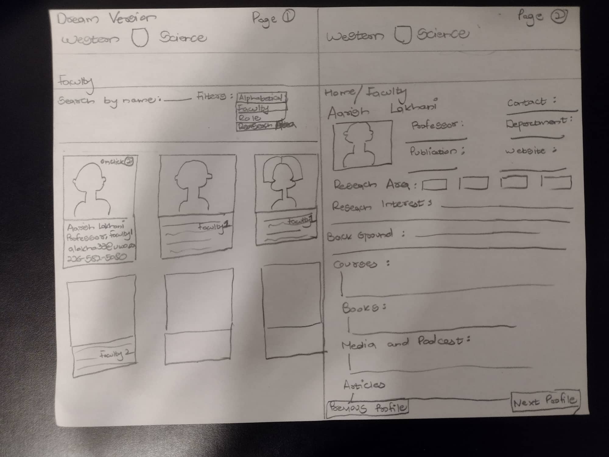
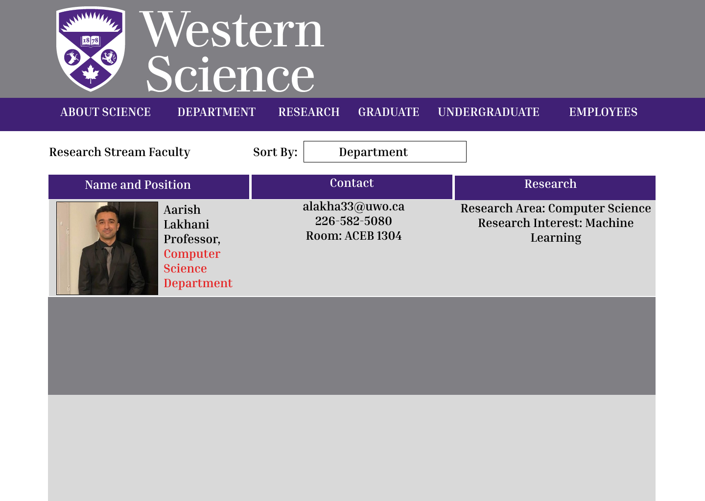
Mock Designs
- UI Page-Minimum Viable Option
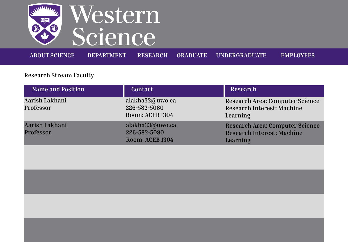
- UI Page- Medium Version
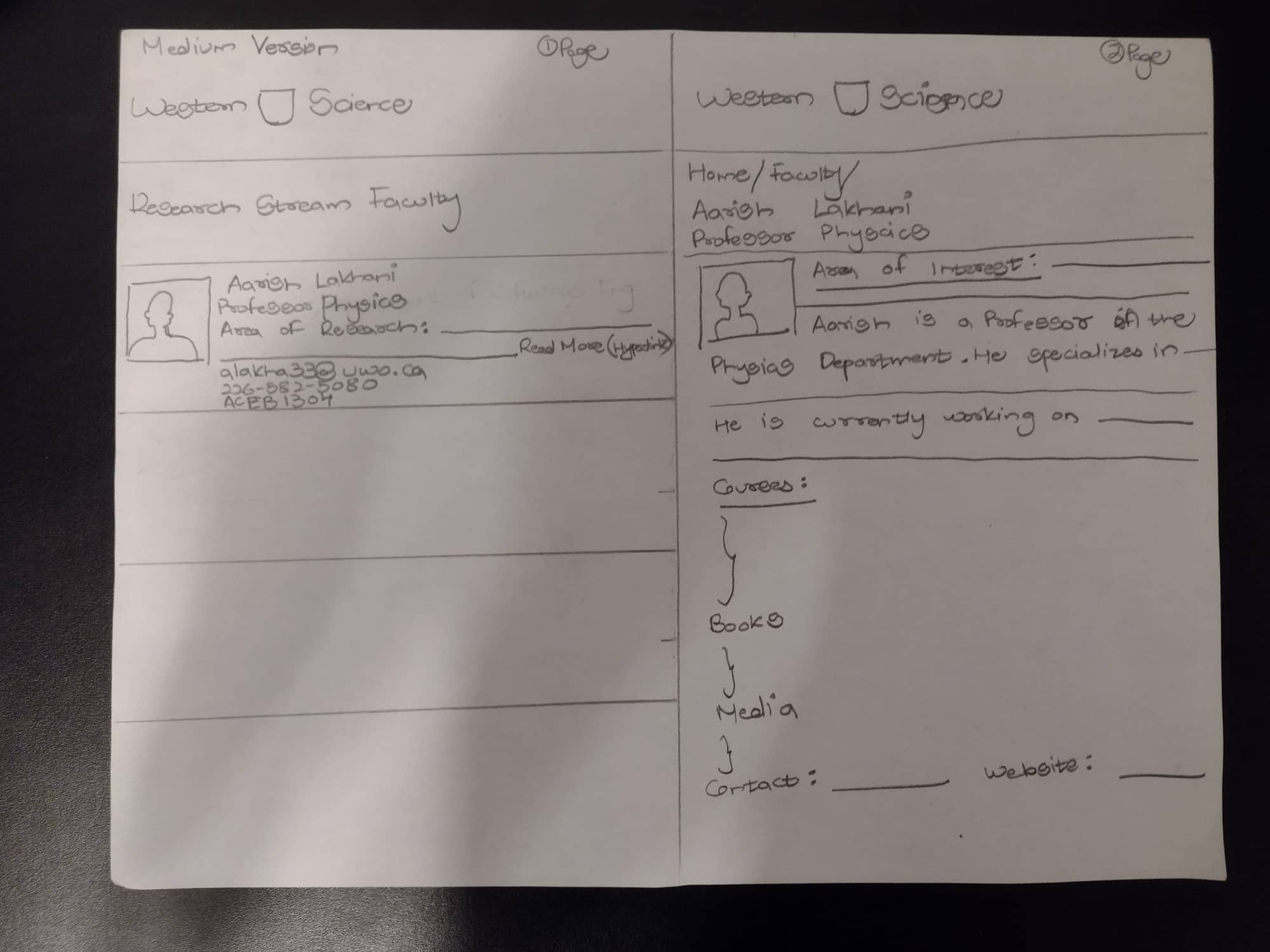
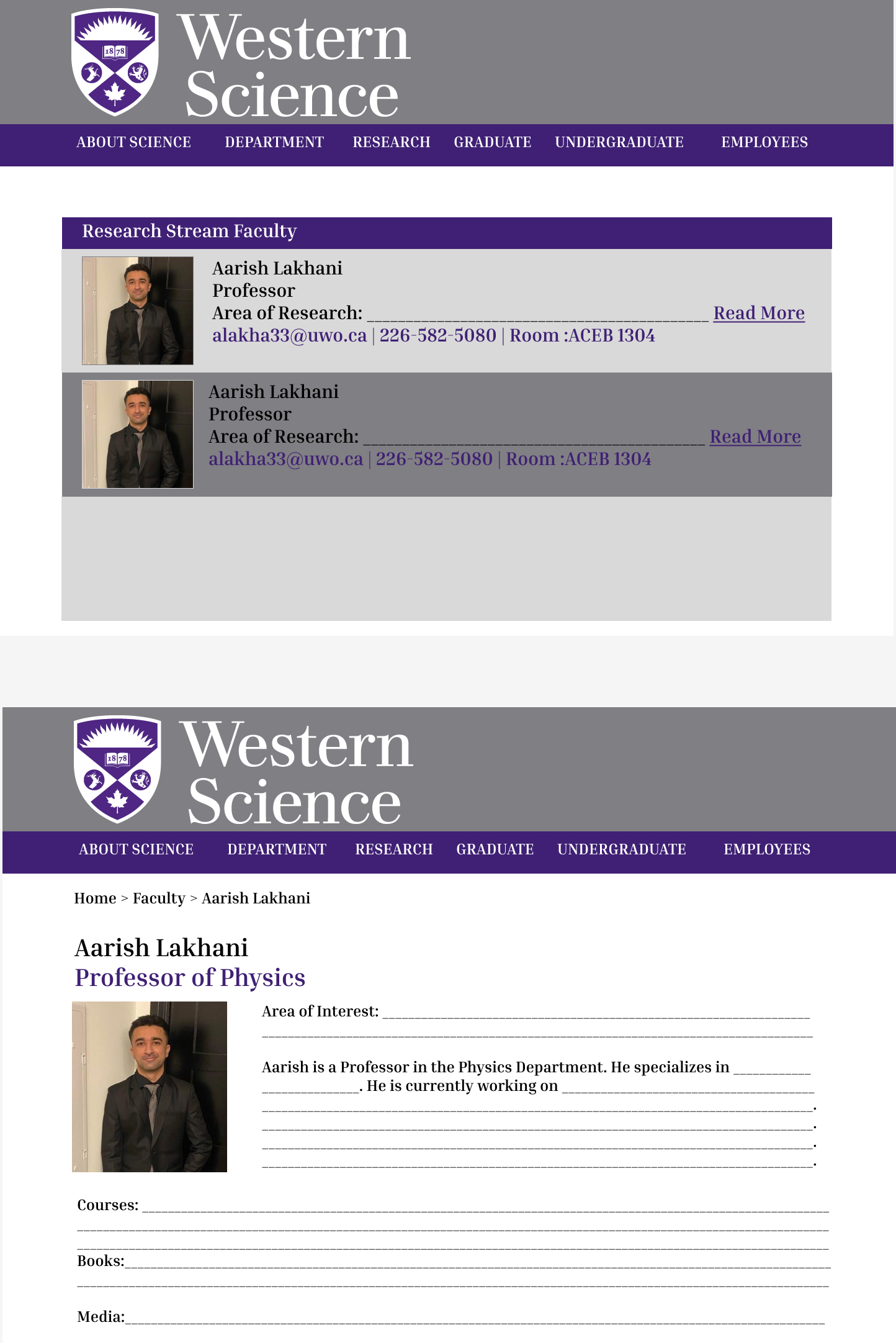
- Dream Version
Figma 2.0
- Test Minimum Viable Option with Pictures
Thoughts: I tested MVP using pictures but it felt a little out of place with the my previous format so I also changed the alignment. The UI still doesn't feel pleasing to me. I think its the columns that make it difficult to look but I don't see how putting all the information in one column would make it better.
After consultation with Central Communications discussing back-end configurations and logistics, we realized that “Dream” version was feasible.
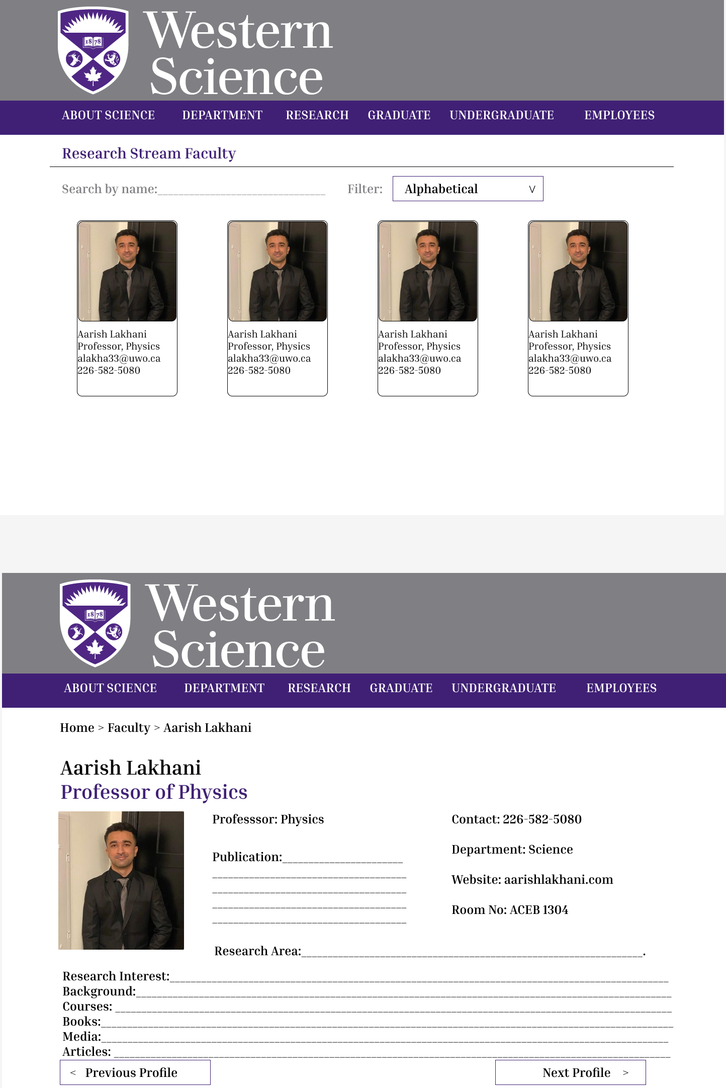
Final Design
After multiple iterations and discussions with the stake holders, heres the final design that I worked on for a month and was agreed as a final go!